Original Article: Global Risk of Coronary Heart Disease: Assessment and Application
Issue Date: August 1, 2010
Available at: https://www.aafp.org/afp/2010/0801/p265.html
to the editor: I found the article “Global Risk of Coronary Heart Disease: Assessment and Application'' very helpful. However, I have a concern about the Cates plot illustrated in Figure 3, which I find potentially useful. The Cates plot does not show serious adverse effects caused by aspirin use, which may result in hospitalization or death in some patients from gastrointestinal blood loss.1 Perhaps an additional color of sad faces can be included in such a plot to represent the number of patients per 1,000 who would be adversely affected by aspirin chemoprevention. As illustrated in the article, the figure includes only benefits, but not risks, of aspirin chemoprevention.
REFERENCE
- 1.U. S. Preventive Services Task Force. Aspirin for the prevention of cardiovascular disease: U.S. Preventive Services Task Force recommendation statement. Ann Intern Med. 2009;150(6):396-404.
in reply: We thank Dr. Moscow for his letter and agree that the portrayal of the potential harms of aspirin therapy would add to the clinical usefulness of the pictograph. The accompanying figure is an example of how benefits and harms might be congruently displayed. In a group of 1,000 men 45 to 59 years of age who have a 10 percent global risk of a coronary heart disease event, the following outcomes can be expected over 10 years of aspirin therapy: approximately eight men will have gastrointestinal bleeding from aspirin use, and approximately one person would have a hemorrhagic stroke.1 Although this kind of simultaneous portrayal of potential benefits and risks has been described,2 we found no evidence of the effectiveness of this approach. An alternative to the single pictograph would be to show a second pictograph beside it to illustrate the potential harms of treatment.3 This may be a better approach because there is no way to predict overlap (or lack of overlap) among patients who may benefit and those who may be harmed.
Figure. Cates Plot Showing Risks and Benefits of Aspirin Chemoprevention
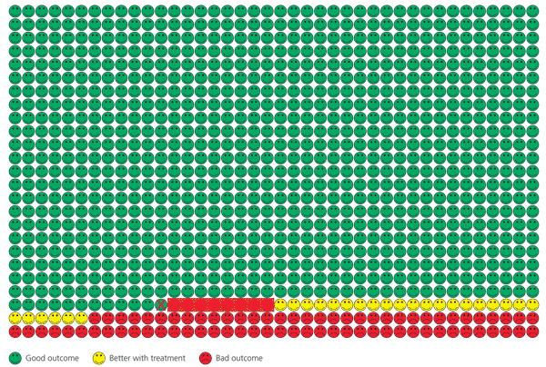
Modified pictograph showing addition of potential harms of aspirin chemoprevention.
The pictograph shows a population of 1,000 men 45 to 59 years of age who have a 10 percent global risk of a coronary heart disease (CHD) event and who have been receiving aspirin for 10 years to reduce their risk. Green faces represent the number of men who would not benefit because they are not among the 10 percent predicted to have a CHD-related event. The red faces represent the approximate number of men who would have an event despite receiving aspirin. The yellow faces represent the men who would not have an event because it was prevented by aspirin. The reddened rectangle highlights the approximate number of people who would have a gastrointestinal bleed. The red X indicates the one person on average who would sustain a hemorrhagic stroke as a result of receiving the aspirin.
Reprinted with permission from Dr. Chris Cates' EBM Web site. http://nntonline.net/visualrx. Accessed May 23, 2011.